When Phoenix 1.4 was released, the default CSS framework became Milligram as opposed to Bootstrap. In this post we’ll look at how to switch out Milligram for Bootstrap in a Phoenix 1.4 application.
Getting started
We’ll start off by creating a new Phoenix application and then look at how to go about getting Bootstrap installed.
Terminal
mix phx.new bootstrap
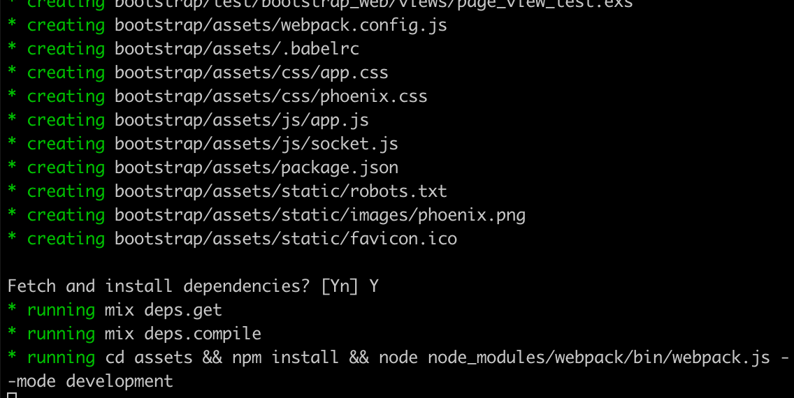
Choose Y when asked to fetch and install dependencies. Now we’ll change into the application directory and create the database.
Terminal
cd bootstrap
mix ecto.create
And with that we’re ready to tackle installing Bootstrap.
Installing Bootstrap
There are three tasks we need to complete to get Bootstrap up and running in Phoenix:
- Install Sass.
- Install Bootstrap.
- Install Fontawesome.
So without further ado, let’s get at it!
Installing Sass
Our first task is to install Sass. To do so we can use npm.
We’ll change into the assets directory, and then run the necessary npm commands.
Terminal
cd assets
npm install --save-dev node-sass sass-loader
Once that is complete we can rename our .css file to .scss.
Terminal
mv css/app.css css/app.scssWe now need to update app.js to point to the renamed file.
/assets/js/app.js
// We need to import the CSS so that webpack will load it.
// The MiniCssExtractPlugin is used to separate it out into
// its own CSS file.
import css from "../css/app.scss"
...
...
And finally we need to update webpack.config.js so that our Sass files get processed.
/assets/webpack.config.js …line 31
{
  test: /\.s?css$/,
  use: [MiniCssExtractPlugin.loader, 'css-loader', 'sass-loader']
}
All we’ve done here is alter the test statement to match on both .css and .scss; and then in the use section we’ve added sass-loader.
We are now good to go with Sass. Onto Bootstrap!
Installing Bootstrap
While still in the assets directory:
Terminal
npm install --save-dev bootstrap jquery popper.jsNote that jquery and popper.js are required by Bootstrap, thus we are installing them as well.
Now we need to import Bootstrap in app.js.
/assets/js/app.js
// We need to import the CSS so that webpack will load it.
// The MiniCssExtractPlugin is used to separate it out into
// its own CSS file.
import 'bootstrap';
import css from "../css/app.scss"
...
...
And we can remove phoenix.css as we won’t be using it anymore.
Terminal
rm css/phoenix.css
touch css/_custom.scss
We’re also creating a custom.scss file which can be used to over-ride the Bootstrap defaults. For instance if we were feeling in a purple mood we could do something like:
/assets/css/_custom.scss
$primary: purple;This would affect items marked with the primary class. So if we have a button with a class of btn-primary, we’d see.

The final step is to import our custom file and the Bootstrap scss file in app.scss.
/assets/css/app.scss
/* This file is for your main application css. */

@import "custom";
@import '../node_modules/bootstrap/scss/bootstrap';
And we’re done! Now we’ll add icon support via Fontawesome.
Installing Fontawesome
I generally tend to use the Fontawesome CDN and this is the approach we’ll take here as well. This means all we need to do is update our application header to include the CDN link.
/lib/bootstrap_web/templates/layout/app.html.eex
<!DOCTYPE html>
<html lang="en">
  <head>
    <meta charset="utf-8"/>
    <meta http-equiv="X-UA-Compatible" content="IE=edge"/>
    <meta name="viewport" content="width=device-width, initial-scale=1.0"/>
    <title>Bootstrap · Phoenix Framework</title>
    <link rel="stylesheet" href="https://use.fontawesome.com/releases/v5.7.2/css/all.css" integrity="sha384-fnmOCqbTlWIlj8LyTjo7mOUStjsKC4pOpQbqyi7RrhN7udi9RwhKkMHpvLbHG9Sr" crossorigin="anonymous">
    <link rel="stylesheet" href="<%= Routes.static_path(@conn, "/css/app.css") %>"/>
  </head>
  ...
  ...
And that’s it, we’re ready for a test run.
Testing it out
Let’s navigate to the root directory and fire up the server.
Terminal
cd ..
mix phx.server
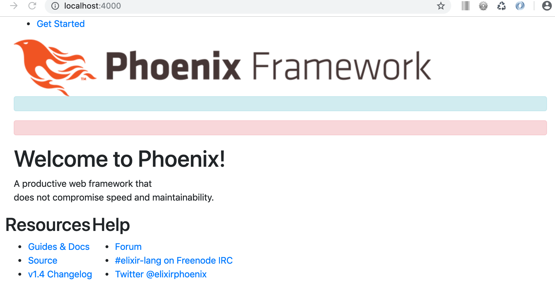
If we navigate to http://localhost:4000/ we’ll see our beautiful home page!

Or not!
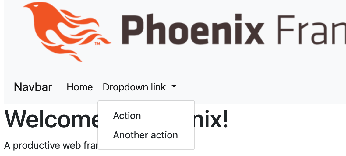
Now that we are using Bootstrap we’ll need to use Bootstrap classes to make our HTML look good. I won’t go over re-styling the default Phoenix homepage, but just to make sure Bootstrap is working let’s throw a navigation bar onto our page.
/lib/bootstrap_web/templates/page/index.html.eex
<nav class="navbar navbar-expand-lg navbar-light bg-light">
  <a class="navbar-brand" href="#">Navbar</a>
  <button class="navbar-toggler" type="button" data-toggle="collapse" data-target="#navbarNavDropdown" aria-controls="navbarNavDropdown" aria-expanded="false" aria-label="Toggle navigation">
    <span class="navbar-toggler-icon"></span>
  </button>
  <div class="collapse navbar-collapse" id="navbarNavDropdown">
    <ul class="navbar-nav">
      <li class="nav-item active">
        <a class="nav-link" href="#">Home <span class="sr-only">(current)</span></a>
      </li>

      <li class="nav-item dropdown">
        <a class="nav-link dropdown-toggle" href="#" id="navbarDropdownMenuLink" role="button" data-toggle="dropdown" aria-haspopup="true" aria-expanded="false">
          Dropdown link
        </a>
        <div class="dropdown-menu" aria-labelledby="navbarDropdownMenuLink">
          <a class="dropdown-item" href="#">Action</a>
          <a class="dropdown-item" href="#">Another action</a>
        </div>
      </li>
    </ul>
  </div>
</nav>
...
...
We can see the navigation bar is showing correctly and the dropdown menu is also working, indicating the jQuery Bootstrap components are all good.
With that confirmed let’s deal with one problem in the current layout; the alert sections are always appearing, i.e.

So we need to wrap these in conditional statements.
/lib/bootstrap_web/templates/layout/app.html.eex
<main role="main" class="container">
  <%= unless is_nil(get_flash(@conn, :info)) do %>
    <p class="alert alert-info" role="alert"><%= get_flash(@conn, :info) %></p>
  <% end %>
  <%= unless is_nil(get_flash(@conn, :error)) do %>
    <p class="alert alert-danger" role="alert"><%= get_flash(@conn, :error) %></p>
  <% end %>
  <%= render @view_module, @view_template, assigns %>
</main>
That pretty much wraps things up, one more item to make note of however is that the default form helpers won’t work very well without some adjustments.
For instance if we have a simple form created via a generator such as:
It won’t look very good!

The error message won’t display great either.

The error message fix is easy, we just need to remove the paragraph tag.
i.e.
becomes:
Fixing the form itself requires a little more effort.
One (not very attractive) option is to code the form explicitly instead of using form helpers, i.e.
With this option, you’d also need to deal with properly displaying errors on individual fields. So I really would not recommend this approach.
The better option is to create some custom form helpers. This is a good post that should help you get started. And if you’re just looking for some code, this is a great GitHubGist that sums things up well. And finally, this post provides some good information around how you can test your custom form helpers.
A final option would be to use a package, for instance there is https://github.com/GBH/phoenix_bootstrap_form which looks like it could be promising.
My preference in this case would be to write custom form helpers, it’s easy to do and this way you have complete control of what is being rendered.
Summary
So it’s a bit of effort to get Phoenix working well with Bootstrap, but I think the change to using Milligram as a default makes sense. What with the jQuery dependencies of Bootstrap and the more verbose classes required; the switch to Milligram makes it easier to swap in one’s desired CSS framework.
Bootstrap is definitely no longer the obvious option when it comes to CSS frameworks. A number of popular frameworks have sprung up over the years such as Bulma, Foundation, Semantic UI, Materialize, and many others.
For the most part using these frameworks within Phoenix is going to require similar steps to what we did to get Bootstrap working. You’ll want to look for Webpack and Sass specific installation instructions. Of course using a CDN is also always an option and is a good way to quickly test out a new framework and have a go at it.
In anycase, thanks for reading and I hope you enjoyed the post!