Recently I made some changes to my hobby Rails budget application. In reality, this “budget” application is really more of an expense tracker application as it doesn’t actually have any budgeting functionality. This has worked well for me in the past, but coming into the new year I want to watch my budget a little closer; so now is a great time to add a budget feature!
We see here a common trap when dealing with a legacy code base… really we should be upgrading and strengthing the existing code… but adding new features always tends to compete with the more mundane task of upgrading the existing code. In this case the new feature is winning out over upgrading… so let’s see what we’ll be doing.
What we’ll be adding
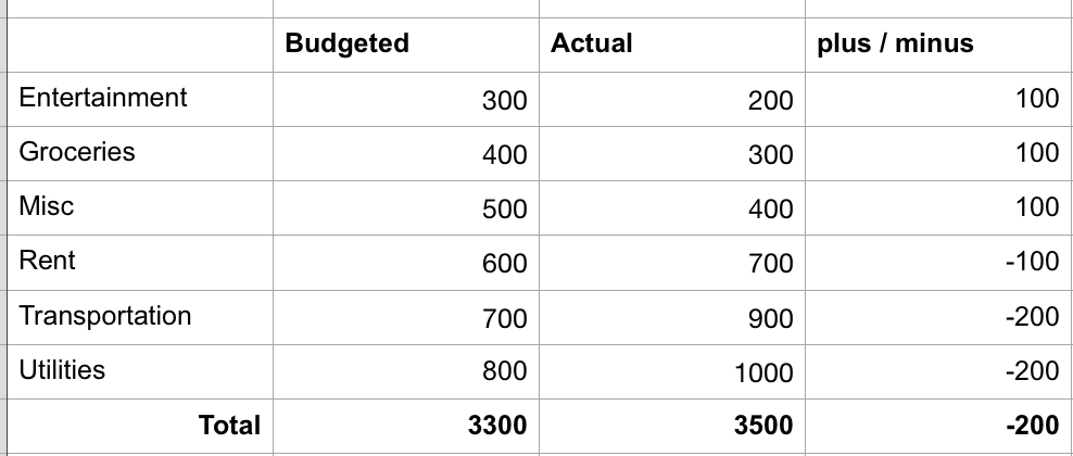
We’ll be adding a new “budget” page to our application. A rough proto-type of what we’ll be looking to add is:

So nothing too complicated!
Today’s objective
Today we’ll be taking things pretty easy, all we’re looking to do is add a new placeholder page for our budget functionality and we’ll update our navigation links to include the new page.
Getting started
Similar to the legacy code series of posts, I’m not sure this is really a “follow along” type of series, I’m more doing it for my own documentation. I will set things up so that following along is possible however.
The first step is to grab our code from GitHub. I’ve created a “budget feature branch” for the new functionality.
Clone the Repo:
Terminal
git clone -b bfb-starting-point https://github.com/riebeekn/wmcgy2 budget-app
cd budget-app
After grabbing the code we should set our local Ruby version and run bundle install.
Terminal
rbenv local 2.3.6Terminal
bundle installNext let’s create a new branch for today’s work.
Terminal
git checkout -b bfb-initial-UI-updatesWith that out of the way, let’s make sure we can run everything locally prior to making any changes.
Getting our code running locally
Before we get going on making any changes, let’s make sure everything is currently working as expected.
Create the DB
The first step in getting our code running is to create our database user; create the database; and then run the migrations.
Terminal
createuser wmcgy2 -d
createdb -Owmcgy2 -Eutf8 wmcgy2_development
createdb -Owmcgy2 -Eutf8 wmcgy2_test
Now we’ll run our migrations:
Terminal
bundle exec rake db:drop db:create db:migrate db:test:prepareRun the tests
And let’s make sure all our tests are passing.
Terminal
bundle exec rspec spec/
Setting up a user
The next step is to run the application locally and set-up a user.
Terminal
rails sI won’t go thru creating a user with the UI… it is pretty straight-forward… if you run into any issues, step by step instructions are included in Part 2 of the legacy code series of posts.
With our code running, the tests passing and a user created we are now ready to move on to tackling our changes.
Update the UI
All of today’s changes are going to be dealing with the UI. We’ll be doing the following:
- Add a placeholder Budget page.
- Update our navigation links to include the Budget page.
Adding a blank budget page
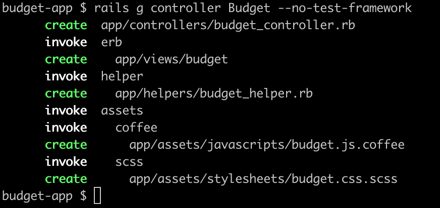
We’ll start off by adding the placeholder page. We can use a generator to create the primary files we require.
Terminal
rails g controller Budget --no-test-framework
Next we need to add a view for the page.
Terminal
touch app/views/budget/index.html.erbWe’ll just throw a heading and a page title into the view page for now.
/app/views/budget/index.html.erb
<% provide(:title, 'Budget') %>
<h1>Budget</h1>
In the same vein we’ll add an empty index method in the controller.
/app/controllers/budget_controller.rb
class BudgetController < ApplicationController

  def index

  end
end
Next we need to update our routes file.
/config/routes.rb
...
...
resources :reports,           only: [:index]
resources :contacts,          only: [:new, :create]
resources :budget,            only: [:index]

match '/budget',  to: 'budget#index'
match '/about',   to: 'static_pages#about'

match '/contact', to: 'contacts#new', as: :new_contact
...
...
Pretty simple, we’ve just added two entries for the budget page to represent the index route.
Let’s have a quick look and validate that our new routes show up as expected.
Terminal
bundle exec rake routes
Looks good!
We should now be able to navigate to the Budget page.

Our placeholder page shows up, so we can now move onto the navigation.
Updating the navigation.
I think it makes sense to add the Budget navigation item directly after the existing Categories link.
We can do so by altering the _signed_in_header file.
/app/views/layouts/_signed_in_header.html.erb
...
<li><%= link_to "Categories", categories_path, class: "lead" %></li>
<li class="divider-vertical"></li>
<li><%= link_to "Budget", budget_path, class: "lead" %></li>
<li class="divider-vertical"></li>
<li><%= link_to "Reports", reports_path, class: "lead" %></li>
<li class="divider-vertical"></li>
...
This work alright, but I think this makes the navigation header too big, and this is going to cause some less than ideal UI experiences, for instance this does not look very good!

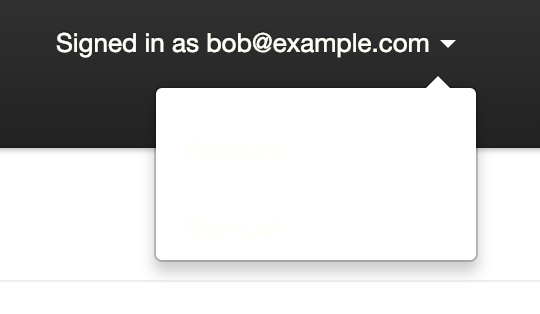
So I think what will work better is if we convert the right hand menu to a drop-down that contains the Account and Sign out links. We can then remove the Account link from the main navigation menu.
/app/views/layouts/_signed_in_header.html.erb
<ul class="nav">
  <li class="divider-vertical"></li>
  <li><%= link_to "Transactions", root_path, class: "lead" %></li>
  <li class="divider-vertical"></li>
  <li><%= link_to "Categories", categories_path, class: "lead" %></li>
  <li class="divider-vertical"></li>
  <li><%= link_to "Budget", budget_path, class: "lead" %></li>
  <li class="divider-vertical"></li>
  <li><%= link_to "Reports", reports_path, class: "lead" %></li>
  <li class="divider-vertical"></li>
</ul>
<ul class="nav pull-right">
  <li class="dropdown">
    <a href="#" class="dropdown-toggle" data-toggle="dropdown">
      <%= "Signed in as #{current_user.email}" %>
      <b class="caret"></b>
    </a>
    <ul class="dropdown-menu">
      <li><%= link_to "Account", account_path, :id => "accountLink" %></li>
      <li><%= link_to "Sign out", signout_path %></li>
    </ul>
  </li>
</ul>
Note we’ve added an id property to the account link… this is to make selecting the link easier when it comes to updating our tests.
Anyway, the only problem with the above is the links in the dropdown are currently white… so don’t show up on the white dropdown background!

A quick style update should solve things.
/app/assets/stylesheets/layout.css.scss
header {
  li { padding-top: 15px; }
  .divider-vertical { height: 70px !important; }
  .current-user { color: #FEFFF7; }
  .pull-right {
    a {
      color: #FEFFF7 !important;
      &:hover { color: #999 !important; }
		}
    .dropdown-menu {
      a {
        color: #000 !important;
      }
    }
  }
  ...
  ...
We’ve added a new style for the links within our dropdown menu by setting the color for the dropdown-menu class.
The navigation now looks much better.

That’s pretty much it for our changes, so now would be a good time to re-run and update our tests.
Updating the tests
Let’s see if our changes have caused any issues with our tests… I would imagine so, considering we’ve moved some things around on our navigation header.
Terminal
bundle exec rspec spec/
One failing test, let’s have a look and see what is going on.
/spec/requests/static_pages_spec.rb …line 29
describe "should have the right links on the header" do
  describe "when not signed in" do
    before { visit root_path }
    it { should_not have_link("Transactions")}
    it { should_not have_link("Categories") }
    it { should_not have_link("Sign out") }
    it { should_not have_content("Signed in as") }
  end

  describe "when signed in" do
    let(:user) { FactoryGirl.create(:user, active: true) }
    before do
      sign_in user
    end
    it { should have_link("Transactions") }
    it { should have_link("Categories") }
    it { should have_link("Reports") }
    it { should have_link("Account") }
    it { should have_link("Sign out") }
    it { should have_link("Signed in as #{user.email}") }
    it { should_not have_link("Sign in") }
    it { should_not have_link("Sign up") }

    ...
    ...  line 53
    ...

    it "should navigate to the correct page when header links are clicked" do
        visit root_path
        click_link "Transactions"
        page.should have_selector("title", text: full_title("Transactions"))
        click_link "Categories"
        page.should have_selector("title", text: full_title("Categories"))
        click_link "Reports"
        page.should have_selector("title", text: full_title("Reports"))
        click_link "Account"
        page.should have_selector("title", text: full_title("Account Settings"))
        visit root_path
        click_link "Signed in as #{user.email}"
        page.should have_selector("title", text: full_title("Account Settings"))
      end
So we need to make some changes to the tests that check which links are displayed, and also to the tests that check the functionality of the navigation links.
/spec/requests/static_pages_spec.rb …line 29
describe "should have the right links on the header" do
    describe "when not signed in" do
      before { visit root_path }
      it { should_not have_link("Transactions")}
      it { should_not have_link("Categories") }
      it { should_not have_link("Budget")}
      it { should_not have_link("Sign out") }
      it { should_not have_content("Signed in as") }
    end

    describe "when signed in" do
      let(:user) { FactoryGirl.create(:user, active: true) }
      before do
        sign_in user
      end
      it { should have_link("Transactions") }
      it { should have_link("Categories") }
      it { should have_link("Reports") }
      it { should have_link("Budget") }
      it { should have_link("Sign out") }
      it { should have_link("Signed in as #{user.email}") }
      it { should_not have_link("Sign in") }
      it { should_not have_link("Sign up") }

      it "should navigate to the correct page when header links are clicked" do
        visit root_path
        click_link "Transactions"
        page.should have_selector("title", text: full_title("Transactions"))
        click_link "Categories"
        page.should have_selector("title", text: full_title("Categories"))
        click_link "Reports"
        page.should have_selector("title", text: full_title("Reports"))
        click_link "Budget"
        page.should have_selector("title", text: full_title("Budget"))
        visit root_path
        find("#accountLink", visible: false).click
        page.should have_selector("title", text: full_title("Account Settings"))
      end
    end
  end
end
We’ve made a few changes to the test. We’ve updated the when not signed in section to check to ensure that the Budget page doesn’t show up when a user is not signed in. Conversely in the when signed in section we’re ensuring the Budget link does show up. Finally we’ve added a test in the should navigate to the correct page when header links are clicked section for the Budget page and we’ve also updated the Account link test to make use of our accountLink id mentionned earlier, as we can no longer simply click on the Account link as it is now contained within the dropdown menu.
We also need to update secure_pages_spec.rb.
/spec/requests/secure_pages_spec.rb …line 15
describe "categories" do
    it "should prevent access when not signed in" do
      visit categories_path
      check_path_and_message(current_path)
    end
  end

  describe "budget" do
    it "should prevent access when not signed in" do
      visit budget_path
      check_path_and_message(current_path)
    end
  end
We’ve added a test for our new page under the existing categories test.
Let’s re-run the tests.
Terminal
bundle exec rspec spec/
Fantastic! We can merge our changes to our feature branch and remove the current working branch.
Terminal
git add .
git commit -am "added placeholder budget page and updated navigation"
git checkout budget-feature-branch
git merge bfb-initial-UI-updates
git branch -d bfb-initial-UI-updates
Summary
So that’s it for today, a pretty gentle start to implementing our new functionality!
Next time, we’ll be looking to add some actual content to the Budget page.
Thanks for reading and I hope you enjoyed the post!